Easel.ly Tips for Designers: Create Stunning Infographics in 2025
- Master template customization and use Easel.ly’s asset library for impactful visuals.
- Understand effective data visualization techniques to tell compelling stories.
- Leverage collaboration features to streamline team projects.
- Utilize keyboard shortcuts to dramatically speed up your design workflow.
- Go beyond basic templates to create unique, branded content.
Hey there, fellow designer! Ever felt like you needed a quick, intuitive tool to whip up stunning infographics or engaging visual content without diving deep into complex software? That’s where Easel.ly shines. It’s an online infographic maker that helps both seasoned pros and those just starting out to create impactful designs. Mastering a few key Easel.ly tips can truly transform your design workflow, making your visuals go from good to absolutely great.
Easel.ly is a user-friendly online platform made for simplifying the creation of infographics, presentations, and all sorts of visual content. It gives you a huge selection of templates, icons, fonts, and images, so you can easily turn complex information into captivating visual stories. For designers, it’s a powerful companion for quickly prototyping ideas, collaborating on projects, and churning out polished deliverables efficiently. Let’s explore some crucial Easel.ly tips to get you started and beyond.
How can Easel.ly boost your graphic design workflow and create stunning infographics?
Easel.ly can seriously enhance your design workflow by streamlining visual content creation. Getting started is pretty straightforward, but a few core techniques can really elevate your initial creations. This section focuses on getting you comfortable with the platform’s fundamental capabilities and how to make the most of them for your design process.
What Easel.ly tricks help with layout and organizing your visual content?
When it comes to creating compelling visuals, efficient layout is absolutely crucial. A few clever Easel.ly tricks can dramatically improve your design process and help you organize your visual content. Always begin by defining your visual hierarchy. Think about what information is most important. You can highlight key data points using larger fonts, brighter colors, or central placement. Make sure to use the alignment and grouping tools often; they’re fantastic for keeping your designs clean and professional. Also, don’t hesitate to experiment with different canvas sizes to perfectly match your output needs, whether it’s for web, print, or social media. If you’re new to this, we’ve got a more in-depth guide on Easel.ly for Beginners that can help you get comfortable.
Once you’re confident with the basics, it’s time to explore some more advanced Easel.ly tips to truly personalize and differentiate your designs. Easel.ly offers layers of customization that go way beyond simple drag-and-drop, helping your infographics really stand out.
How can designers go beyond Easel.ly templates for truly unique infographics?
One of the most powerful Easel.ly hacks is viewing templates as a starting point, not the final destination. Instead of just using them as-is, deconstruct them, understand their structure, and then rebuild them with your brand’s unique personality. Seriously, don’t be shy about uploading your custom fonts, logos, and brand assets – this ensures your visual identity stays consistent across all your communications. Dig into the vast icon library, and get creative by combining multiple icons to form new, unique visual elements that convey complex ideas with elegant simplicity.
While Easel.ly is fantastic for its ease of use, it’s good to know what else is out there. If you’re curious about other graphic design tools, our discussion on Easel.ly Alternatives might give you some fresh perspectives.
What Easel.ly shortcuts can speed up your infographic design workflow?
For designers, time is always precious, so incorporating Easel.ly shortcuts into your daily routine can dramatically cut down on design time. Get familiar with the keyboard commands for common actions like copying, pasting, grouping, and aligning. Even though Easel.ly works in your browser, many standard keyboard shortcuts still apply. Think `Ctrl+C` (or `Cmd+C` on Mac) for copy and `Ctrl+V` (or `Cmd+V`) for paste – they are absolute game-changers! Also, using the ‘duplicate’ function for elements is much quicker than starting from scratch every time. Smart use of these shortcuts lets you focus more on creative problem-solving and less on repetitive clicking, boosting your productivity in infographic design.
It’s also worth mentioning that while Easel.ly excels for infographics, tools like Photoshop offer different capabilities for image manipulation. For a deeper comparison of their strengths, take a look at our article on Easel.ly vs Photoshop.
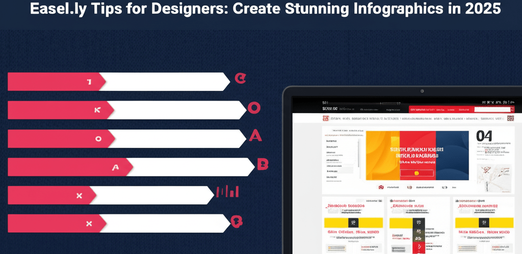
How do you effectively visualize data in Easel.ly infographics?
Clearly presenting data is at the very core of powerful infographic design. Easel.ly makes data visualization accessible, and here are key steps to make your data truly shine:
- Choose the Right Chart: Easel.ly provides a variety of chart types. Pick the one that best tells your data’s story (e.g., a pie chart for proportions, a bar chart for comparisons).
- Simplify Data: Avoid clutter at all costs. Only include essential data points and round numbers where it makes sense for clarity.
- Use Color Strategically: Assign colors to differentiate data sets, but always ensure they are consistent and accessible (remember to consider colorblindness).
- Add Context: Always include clear labels, titles, and sources for your data so your audience understands everything at a glance.
- Maintain Consistency: Make sure all data visualizations within a single infographic follow a consistent style and color scheme for a polished, professional look.
Common questions about using Easel.ly for professional graphic design
Got more questions about getting the most out of your Easel.ly experience? Here are some common queries we hear from designers:
- Can I upload my own images and fonts to Easel.ly?
Yes, absolutely! Easel.ly allows you to upload custom images and fonts, which is fantastic for maintaining strong brand consistency and personalizing your designs. - Is Easel.ly suitable for professional designers?
You bet! While it’s super user-friendly for beginners, Easel.ly packs robust features that professional designers can totally leverage for rapid prototyping, impressive client presentations, and creating highly engaging visual content. - How can I collaborate with team members on Easel.ly?
Easel.ly offers great collaboration features, meaning multiple users can work on the same infographic, share feedback, and make edits in real-time. This really helps streamline team projects and keeps everyone on the same page. - Are there any limits to the number of designs I can create?
The number of designs you can create usually depends on your subscription plan. Paid plans typically offer unlimited design creation and access to even more premium features.
So, there you have it – a collection of essential Easel.ly tips to elevate your infographic and visual content creation. This platform offers a robust canvas, and with these strategies, you’re well-equipped to craft powerful, engaging stories that genuinely resonate with your audience, all while working efficiently and effectively. Happy designing!
- Master Easel.ly templates and asset libraries to create impactful visuals quickly.
- Prioritize clear data visualization with the right charts and strategic color use.
- Utilize keyboard shortcuts and customization to streamline your workflow and make designs truly unique.
Start applying these Easel.ly tips today to transform your visual content and make your design process more efficient than ever!
Further Resources for Graphic Designers: